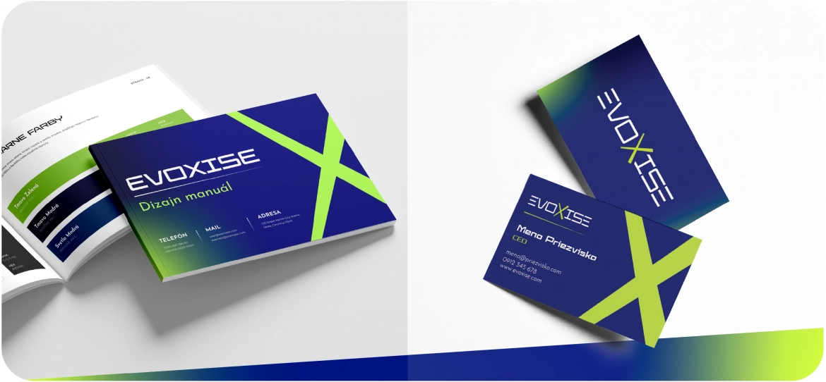
EVOXISE is a specialised fitness studio focused on delivering innovative and effective training solutions designed to support the personal growth and evolution of its clients.
As the EVOXISE brand entered the market, the client approached us to create a visual identity that would clearly communicate the studio’s mission and vision.
The key requirement for the logo was to reflect the concepts of evolution and personal growth. Both the visual identity and colour palette were intended to symbolise the future, progress, innovation, and efficiency. At the same time, the logo needed to convey energy, health, and technological advancement.
We created a logo that reflects the essence of the EVOXISE brand.
The gradient colour scheme, transitioning from green to black, symbolises progress and continuous development, which lies at the heart of the studio’s philosophy.
The geometric shapes and clean lines communicate precision and innovation, making them a natural fit for a fitness studio built around advanced training technologies.
The dynamic yet elegant typeface includes subtle visual effects suggesting movement and transformation, while the distinctive “X” remains simple and direct, reflecting the studio’s individual approach to every client.
What does our client say about us?
“Our new brand needed a fresh and modern logo, and based on the strong reviews, we decided to work with imagons.
Based on our brief, they prepared five concepts. We selected one that matched our requirements perfectly.
Five-star satisfaction, and I would give them six if I could :)”
- Juraj Kopecký, Managing Director
Interested in creating an outstanding and functional corporate identity that perfectly reflects your brand philosophy? We will be happy to help.


